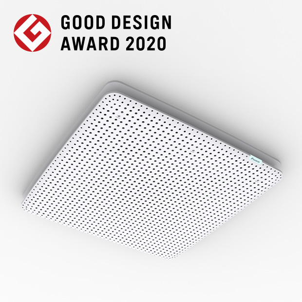


“risora,” an air conditioner for coordinated interiors
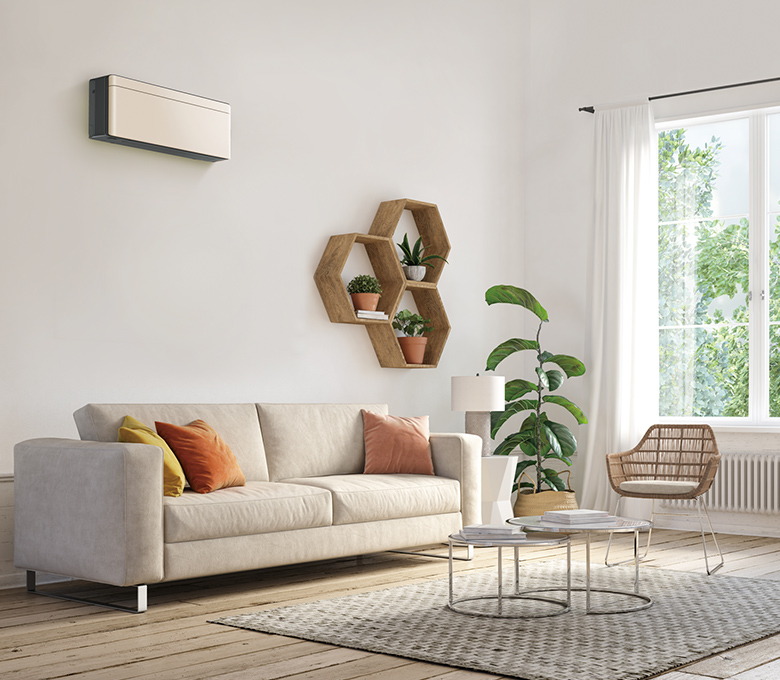
Just as you might enjoy selecting furniture to color coordinate the interior design of your home, we want you to enjoy selecting an air conditioner as a welcomed addition to your interior surroundings. That is idea behind “risora custom style.”
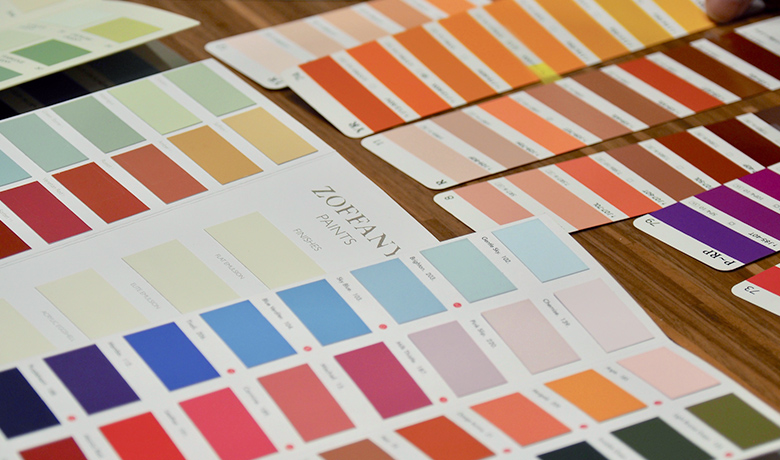
“risora” is an air conditioner developed under the concept of harmony with interiors. In 2019, we began expanding the color lineup with “risora custom style,” and now customers can select from approximately 600 colors centered on 25 recommended colors to find the best match for their interiors.
When promoting this proposal, customers told us how much they enjoyed selecting air conditioners: “I chose a wallpaper that suits the air conditioner. It is now a part of the interior design,” and “‘risora’ made interior coordination even more fun.”
It is a pleasure to hear that “risora” allows many customers to enjoy the process of considering compatibility with other interior elements. To provide such an experience to more people, we have restructured and updated the color lineup of “risora custom style.”
Color categories for different lifestyles
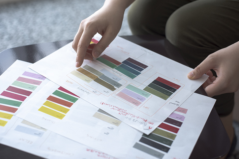
When restructuring the color lineup, we created categories for specific customer personas from a perspective of how people will spend time in a room with “risora.” A map was created in which the horizontal axis represents the number of people who spend time together in the room and the vertical axis represents their interior tastes. From that, we roughly classified usages of space into five categories. These categories permit customers to select an air conditioner based not only on color but also on their lifestyles and how they spend time in the room.
The color lineup of 2019 classified colors by tone, such as vivid and bluish. While it highlighted the beauty and variety of colors, its numerous color options tended to overwhelm those people who had no specific color preference and were unfamiliar with color coordination. People rarely buy a full set of furniture all at once based on a clear, complete interior design plan, but rather they select pieces of furniture one by one to gradually create an overall image. This may be the reason why color selection had always been considered challenging.
Colors that blend into the space for a choice with confidence
With that perspective in mind, we started selecting colors based on interior trends and the trends of products delivered to customers. Among our 25 recommended colors, 15 colors were replaced with new ones. Air conditioners are expensive and used for many years. Amid current economic concerns due to the impact of the novel coronavirus, we anticipate a need for air conditioners in which people can use them for a long time without growing tired of them. On that basis, we selected colors that warmly complement a room and allow customers to choose with confidence.
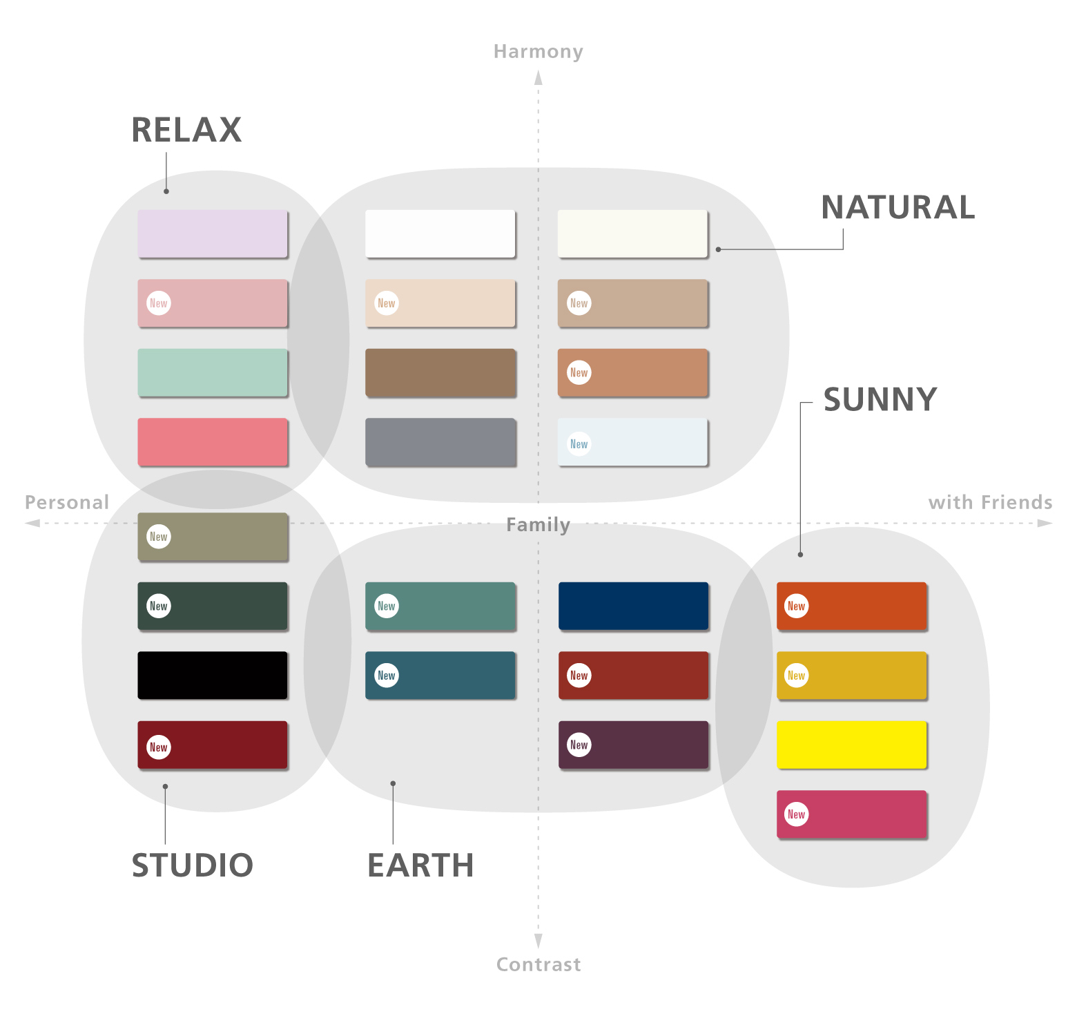
For example, the EARTH category contains colors like natural indigo dye, denim, and terra cotta. Dusty colors go well with antique furniture and similarly-colored curtains and wallpaper that are increasingly becoming popular, and these colors are expanding the range of choices for coordinated design.
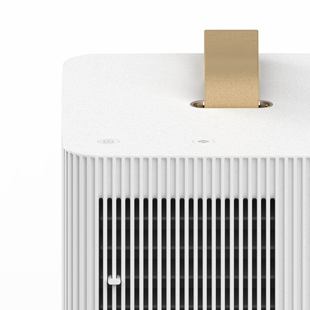
The NATURAL category contains colors adjusted to match common construction materials. We will provide color chips to building contractors so that customers can match the air conditioner with wallpaper and create a sense of harmony in a room. In this update, we increased the number of colors in NATURAL to eight to add easy-to-match neutral gray tones. Customers can enjoy a wide variety of choices, such as a color perfectly matching wallpaper, subtle colors of ivory and rose gray to achieve a soft contrast, and warm shades of brown to create a sense of nature.
In addition to these easy-to-match colors, we continue to adopt rose pink and yellow. Looking back at the products we have delivered so far, these colors are unexpectedly ranked high. Because an interior coordinator told us that more than a few people have a particular preference for pink, we offer three types of pink, including pale pink and deep rose, to suit individual needs.
Color names associated with space
In this update, we also placed importance on color names. In addition to making color tones easier to imagine, we tried to select names associated with the spaces where the product would be installed. For example, the SUNNY category has a concept of a bright dining room to enjoy a meal with friends. So, we selected names of food and flowers commonly seen in such a room, including “carrot,” “mustard,” and “rose.”
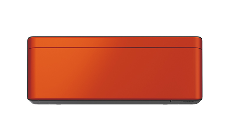
Carrot orange (new color)
On the other hand, the EARTH category is for a stylish, calm space with handwoven textiles, dyed fabrics, pottery, and sedate furniture. For this category, we selected names that would inspire people living there, such as “denim” and “terracotta.”
Identifying with the feelings of customers making a choice
The biggest challenge in this update was the categorization of colors. Because this type of proposal was new to us, it took time to build an internal consensus, and some members doubted if our axes really work. In addition to the conventional categorization by tone, various methods were examined, including categorization by room function, such as living rooms and bedrooms, and by mood, such as vigorous and relaxed.
How can we better identify with the feelings of customers selecting “resora”? This question reminded me of the difficulties I faced in selecting construction materials and wallpaper when I built my house. Like me, many people do not have a clear design style of their own. If customers see these lifestyle categories, they will be able to share their preferences with their families and more easily select construction materials and interior items as well as “risora.” We hope this will help improve satisfaction for purchase of new items and overall design coordination.
Growing importance of a comfortable home
The increase in telecommuting makes people spend more time at home and leads to growing attention to the importance of family time. In this background, creating a home in which people feel comfortable and love their homes even more will become increasingly more important.

Because air conditioners are generally still considered “equipment” rather than “furniture,” people may not initially select them with consideration to interior design. However, when you select air conditioners, furniture, and lighting with a design aim, you develop an emotional attachment to those items. Considering combinations with other pieces of furniture and discussing your ideal space with your family will make you rethink your lifestyle and enjoy it even more. Having a design aim for selection of an air conditioner will not only make you appreciate your air conditioner more but will also give you greater appreciation for all your furniture. Our hope is that “risora custom style” will play a role in that appreciation.
risora Custom Style risora air