monopo is a creative group of people with various talents who work across many different fields ranging from problem-solving to branding. Beach creates attractive visual images that transcend the media framework of publications and advertisements. In this talk, Shun Okada and Jun Okuma from monopo and Shinji Hamana from Beach, who see potential in DK-Power and participated in brand building together with Kei Wakabayashi, shared their thoughts on design concepts, work style, and a sustainable future symbolized by micro-hydro power generation.
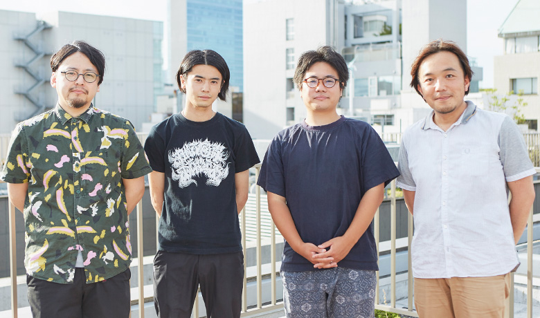
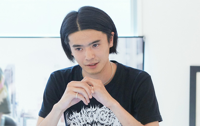
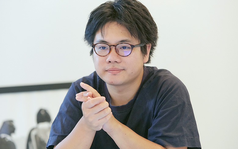
From left to right: Mr. Hamana from Beach, Mr. Okuma and Mr. Okada from monopo, and Ikeda from Daikin Industries
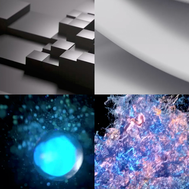
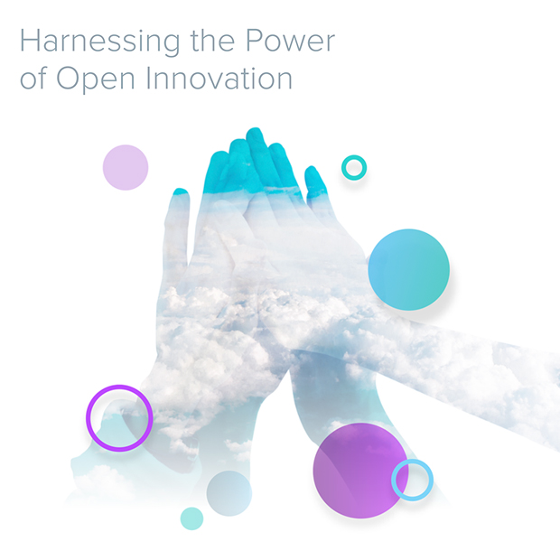
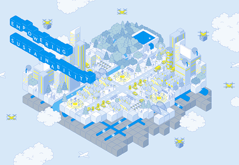
Key visual image to share the worldview
Mr. Shun Okada, COO, monopo (Okada):
When I first learned of DK-Power and its micro-hydro power generation, I found them very interesting. The idea of decentralization is great. Everything is decentralized recently, such as web servers and currencies. I had an impression of energy being generated and granted by behemoths, but the system is gradually becoming decentralized. I realized the time is coming when anyone can generate energy if only they have a mechanism. That’s energy democracy.
Mr. Jun Okuma, Art Director, monopo (Okuma):
It was great to hear Mr. Wakabayashi discuss the subject at the first orientation.
Okada:
It was abstract, but helpful later in doing the design work as we could absorb his thought process.
Junichi Ikeda, Daikin design (Ikeda):
When I saw the key visual image, I was impressed to see a very concrete idea generated from the abstract discussion. I thought you would use some illustrations to describe the concept articulated in the discussion, like a story narrated in pictures, but you beautifully described the concept in a single key visual image.
Mr. Shinji Hamana, President, Beach (Hamana):
While listening to the orientation, I thought it would be impossible to convey all the DK-Power concepts in a single visual image. Instead, I thought I would create an image that serves as a big gateway to encourage people to think “A world with DK Power looks nice,” “I feel good about it,” or “It sounds fun.”
Ikeda:
In fact, explaining everything does not really convey everything. People who visit this website expect to see the future brought about by DK Power, which kindle a feeling of excitement and the impression of a great world.
Hamana:
That’s right. In the end, stimulating the emotions is more important than product specifications.

Strewn with Modules of Exciting Future
Okada:
What I really like about this illustration is that the city is made of a collection of cubes, each of which forms a house or building and evokes an image of combined modules.
Okuma:
The module is closely associated with decentralization. It’s like copy and paste. A certain module is used everywhere. The image describes technologies associated not with cyber but with nature.
Ikeda:
Smart grid and energy usually evoke a cyber image, but Mr. Hamana’s key visual image describes the opposite. However, his image better conveys feelings of comfort and excitement. I feel close to it.
Hamana:
Because I heard Mr. Wakabayashi’s concept first, I did not have a typical technological image at all. Rather, I imagined an exciting future behind technology.
Okuma:
The website also starts by expressing the type of future that the company aims to create, instead of what the company can do.
Showing a Future That Resonates with Audiences
Ikeda:
Mr. Wakabayashi also asked to create the feel of a startup. Startups express their visions, missions, and the future that they want to create, rather than showcasing their products. With little money available for sales promotion, their websites serve as a hub for customers. The key visual image is a catalyst to establishing a mood throughout the website. I wanted to bring that mood to this website.
Okuma:
In that sense, I think his concept was a success. The key visual image is abstract in a positive sense and seizes viewer interest so that viewers want to scroll to the bottom of the page. To meet the expectations of the key visual image, I tried to maintain the something-is-good atmosphere and encourage people to read the text, while reflecting illustrations of motifs and the key visual image Okada told me.
Okada:
It was good to determine the key visual image before producing the website. The atmosphere expands on the logo to create a softer mood that people feel close to. As a result, we achieved consistency in the company’s worldview and successfully created a website in the end. In this way, I think we were able to generate excitement for the future.
Ikeda:
Energy provided by DK-Power and air provided by Daikin Design are both invisible but support and enrich people’s lives. What is important to you when visualizing something invisible?
Okada:
When working with any of my many different clients, I place importance on being visionary. I think value of invisible things can be easily conveyed by discussing why they want to visualize that thing and what future they want to show. For example, we provide a service called “powered by.tokyo.” In that service, people who live in and love Tokyo are defined as Tokyoites. By illustrating Tokyo from their viewpoints, we can have audiences imagine experiences and stories in the city, instead of just introducing sightseeing places.
Hamana:
I engage in infographic design. In short, it is about visualizing information. What audiences really want to see is not information itself but value provided by information. If information is designed well, value is visualized naturally, whereas information is absorbed subconsciously. When this happens, I know that our communication is successful.

