


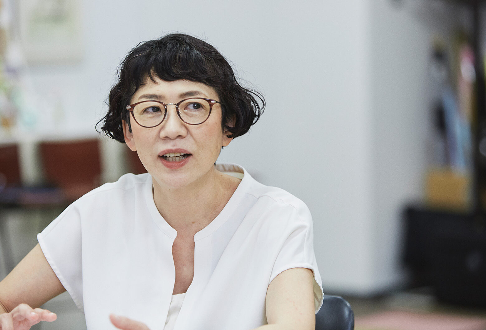
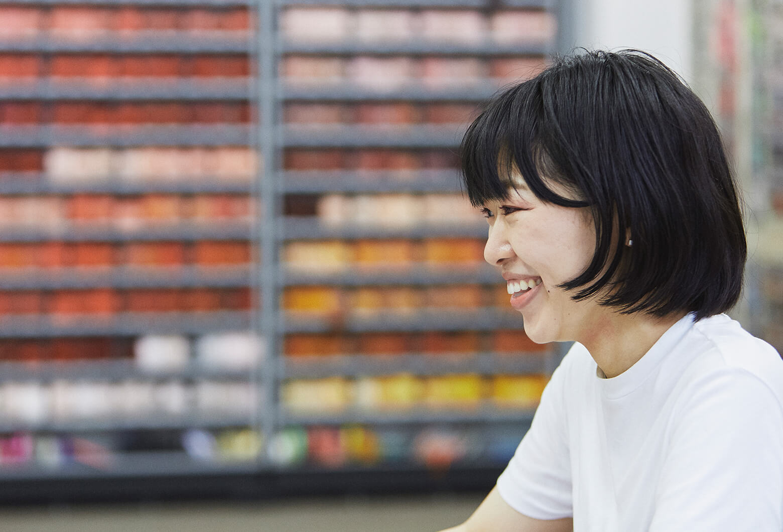
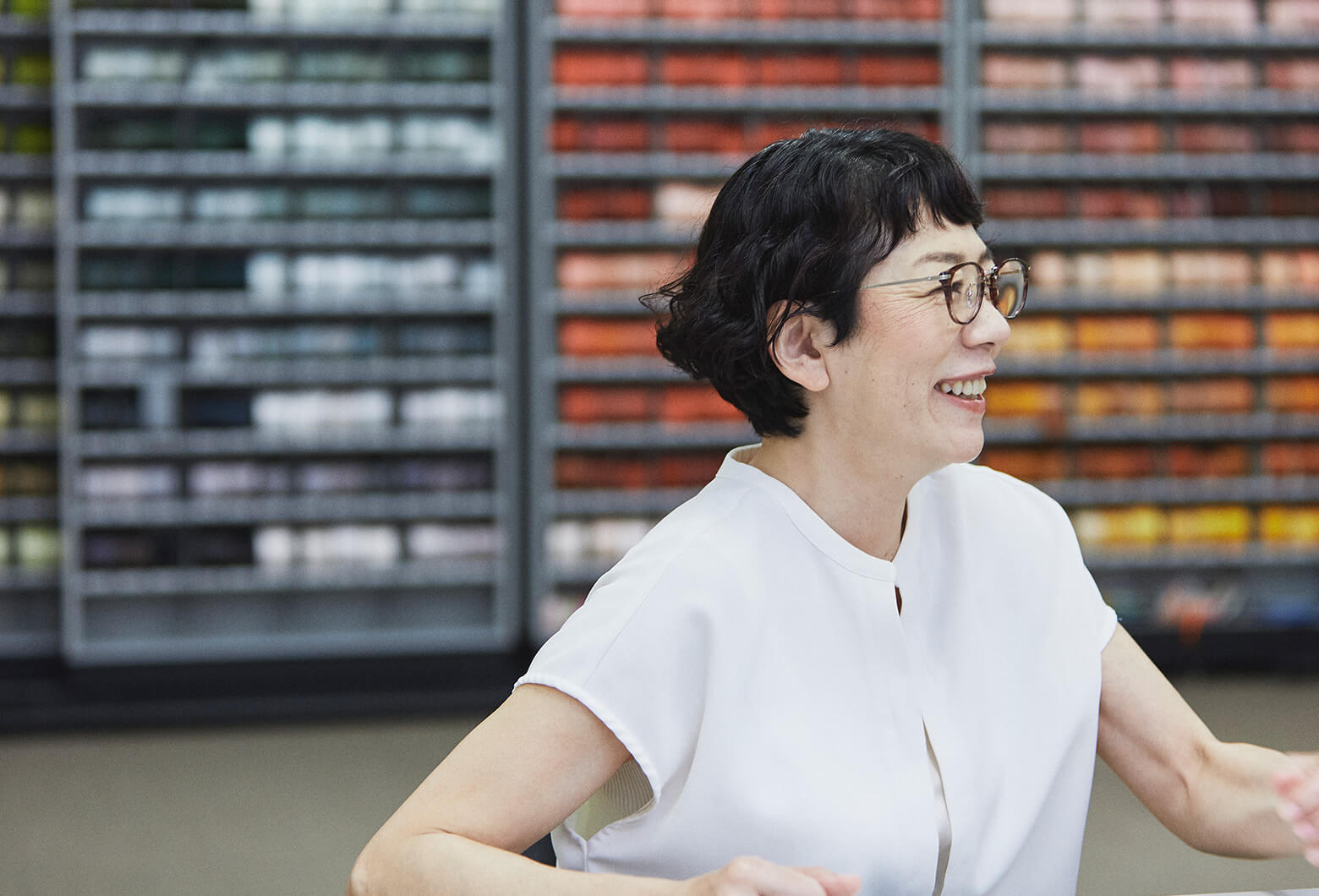
Kahoru Osawa of the Japan Fashion Color Association (JAFCA) plays an important role as the representative of INTERCOLOR Japan by introducing fashionable colors to Japan from around the world. Even while focusing on her main business of color consulting, she still finds time to enthusiastically promote color through various communication activities including color education programs, seminars, and publications. DAIKIN designer Chihiro Yoshikawa caught up with Ms. Osawa, and the two of them delved into the relationship between design and color. This relationship had been a reoccurring theme in the development of the “risora,” an air conditioner that can be customized for stylish color coordination to match interiors.
Yoshikawa:
Being in charge of product and UX design, I have often attended your seminars. Hearing you say that “CMF (color, material, and finish) trends are born from social trends” inspired me to actively investigate trends and new materials. You have extensive knowledge in a wide range of fields, but what I find fascinating is your sense of “normal,” and I mean that it a good way.
Osawa:
I am very happy to hear that. When working to publicize information, it’s easy to forget to value the consumer's perspective. Because we are different from artists, who are attuned to their inner muse, I think we need to adjust our proposals to match those who use our products.
Capturing Colors Representative of the Times
Yoshikawa:
I’d like to incorporate social trends, philosophical trends, and general moods into CMF. Ms. Osawa, what do you do to gain a sense of the next “upcoming wave”?

Osawa:
I think that observing lifestyles is the most important since lifestyles affect the type of design and color that people prefer. Understanding lifestyles requires both a macro perspective that looks at how the world operates along with a micro perspective that looks at individual perceptions including use of biotechnology. These days I think people too often forget that they have bodies and sensory perceptions. Instead, many live a cerebral existence under the illusion that everything about the future can be seen from the beginning.
Yoshikawa:
It's true that there are times when we feel like we know everything because we’ve just learned some new information.
Osawa:
What has surprised me is how young people speed up videos and watch them at twice the speed. Sometimes I have thought that it’s enough to just know the result, but the body should feel the flow of things more slowly. That's why no matter how far society becomes digital, there will always be something that appeals to the senses, namely, CMF, and that will never change.
Yoshikawa:
By bodily sensation, do you mean smell or how something feels on your skin? It's true that having an online meeting is completely different from visiting in person and being able to handle the product samples.
Osawa:
Exactly. Having something to touch appeals to the body. So does color. In searching for where lifestyles are headed, you look for the small buds without trying to predict what’s coming next. I have formed a hypothesis that something is only likely to grow when no one is paying attention, so you try to detect the early signs of change and ask yourself why.
An Era When the Body Seeks the Cutting Edge
Osawa:
When looking at the trends, I can emphatically say there are certain colors within the large flow that are required precisely because we live in a digital society. In the past, for example, metallic and deep blue colors symbolized cutting edge. But now, as technology has become even more advanced, there’s been a shift to something more natural in expression. I perceive the creation of a more indigenous atmosphere where cutting-edge digital technology resides hidden inside.
Yoshikawa:
It's true that interiors and knickknacks have a slightly indigenous taste. With more time being spent in digital spaces, the more important it becomes to have things that give us a sense of the traces and breathing of people.
Osawa:
The reason that they are popular is because the body desires those colors. In other words, what the body is searching for at that time is the cutting edge.
Yoshikawa:
Oh, I see. You mean that on the flipside of what is greatly trending now is something that feels fresh, something that is emerging as the next cutting edge.
Osawa:
Digital space is probably physically frustrating, since humans are animals, and we cannot function unless we can move our bodies. We can't live just by working our brains. That may have something to do with it.
Fashionable Colors Differ by Culture of Each Country
Yoshikawa:
Ms. Osawa, what kind of tricks do you use when you try to introduce INTERCOLOR (fashionable colors for each season determined by the International Commission for Color) to Japan?
Osawa:
You know, it depends on the fabric and material. Also, on what kind of place where you use it. However, the ones requiring the most adjustments are those used close to the skin. For example, Caucasian skin has a brightness of about 7, so what I really like are pinks and beiges with a brightness of about 5.5 to 6. Also, there are colors that are rooted in the culture of each country. In France, pink is quite rooted there, while in China it is overwhelmingly red. Japan tends to prefer colors that have a slight yellow hue to them.
Yoshikawa:
It’s completely different from country to country, isn’t it?
Osawa:
In Japan, we closely identify with nature, which is very similar to the people of Finland. Even when introducing INTERCOLOR to Japan, the materials used for products, interiors, cosmetics, women's apparel, and men's apparel are all different, so we make adjustments accordingly. Also, market trends in Japan change rapidly. For example, while the number of automobile sales does not fluctuate much in Europe, there are huge fluctuations in Japan. So, it follows that Japan is sensitive to trends in both good and bad ways.

Yoshikawa:
I’ve always thought that Europe was the home for trends and a place where trends quickly go out of fashion. And of course, Japanese people love new things.
Interpreting the Volume Zone Market and “Good Color”
Yoshikawa:
While reviewing the colors trending in my daily design work, I keep track of the volume zone market, see what consumers currently like, and alternatively check small changes and ponder what colors are emerging as new and fresh.
Osawa:
Even while keeping in mind who the proposal is for, you also have to be aware of what is needed and what will make it feel fresh.
Yoshikawa:
Yes, but I sometimes wonder if it’s okay to treat the colors of products that didn’t sell well as unwanted and not fashionable. There have been times when I brought out a product and thought, “This will clearly remain a good color even in ten years’ time,” and then later feel guilty if another new color takes its place or the product is discontinued. I guess because I had wanted other people to appreciate as I did.
Osawa:
Certainly, we no longer live in a time when selling only requires increasing the number of colors offered. To a certain extent, you have to be patient and try the made-to-order system when you want to introduce a particular color even if it’s in a higher price range. When that happens, I think we produce something using the power of CMF. In the SDGs, 2030 is set as an endpoint, but it is no longer a problem in which we can be simply stop there. We must change the manufacturing and economic systems. Today, anybody in the world can become a designer, and technological development is progressing to enable manufacturing for that. I think it would be better for major companies to create a circulatory system at an early stage.
For example, the fashion industry used to set the annual clothing trends in order to get consumers to buy clothes, but it is currently moving away from that. Nevertheless, I make new proposals every year. The reason is that people who need the products at that time should feel excitement for them.
In this way, those who need them now will be thrilled, while the products continue to establish themselves in their own way without becoming outdated after a few years on the market.
Era When Air Quality Exerts Control Over Spaces
Yoshikawa:
Today we have talked about the relationship between social change and color, but the COVID-19 pandemic is also an inseparable issue. Has there been any changes in how you perceive air since the occurrence of this pandemic?
Osawa:
Everyone has arrived at their own perception of things that they had previously been unaware of. Personally, I realized that air is so fundamental that it could be described as one of the most important CMFs that formulates space. A space without a designed airflow will not become a “good place” no matter how much you devised the wall of CMF. Therefore, I think that systems will be reconstructed in various places in the future with the color image being pale green and white.
Specifically, from the standpoint of communicating about color, I would like to recommend a color that reminds me of clean air as a CMF.
Yoshikawa:
Recently CMF has gained many keywords like water.
Osawa:
I get a sense that the flow and circulation of things correspond to the trends of the times.
Yoshikawa:
There are also materials like Aurora films that at first appear transparent but change colors depending on the viewing angle. It is suggestive of Nature, which is always changing, but so is air. Water also has its own distinctive fluctuations. Sometimes I’ll put on natural sounds and images to meditate or concentrate on work. So, I guess it’s something I seek out instinctively.

Osawa:
That’s a field called biophilic design (enhancing connectivity to the natural environment in architecture and spatial design to improve mental and physical well-being), isn't it? Air most definitely is a part of that, and I think it’s taking hold.
Yoshikawa:
From architectural space and the airflow circulating outside to the ambience of space environments, there are a wide variety of things that can be done with air design, and it’s an area that shares many similarities with biophilic design that’s popular today.
Our conversation has further motivated me since I could picture an image of using CMF and trend searches in air design that resonates with the five senses.
In the future, I would like to make an in-depth exploration for how to create air and air environments that will delight everyone.