


DK-CONNECT is a cloud-based air conditioning control service that enables central management of air conditioning, lighting, and other facility equipment to operate anytime and anywhere. Since its product launch in 2021, it has been installed in many buildings and facilities, and because of recent changes in social conditions, customers have begun showing enormous interest in energy that grows increasingly stronger every day.
To meet these needs, we released “Energy Visualization” and “Energy-Saving Simulation Service.” When To meet these needs, we released “Energy Visualization” and “Energy-Saving Simulation Service.” When adding new functions, our focus begins by verifying user experience (UX) so that we can develop services from the customer perspective. Allow me to explain how the specific process works.
DK-CONNECT makes it easy to precisely control air inside a facility and provide users with a comfortable and pleasant air environment while substantially reducing the time and labor needed for facility managers to manage operations. Moreover, it has helped facility owners to further boost the asset value of their facilities.
Our "Energy-Saving Simulation Service" helps customers estimate potential savings on their electricity bills by checking the energy consumption status of air conditioners for each system and simulating improvement points, such as an off timer and review of temperature settings.

Adapting to Customer Personality and Activities
Development of this service began nearly two years ago. Previously, DK-CONNECT had made no mention of energy trends in its periodic report, forcing customers to check data by accessing the webpage and downloading the reports themselves.
To free customers from this annoyance and build awareness for energy conservation on a daily basis, we thought it best to present the data that they wanted to see in an easy-to-understand manner. To this end, we first envisioned the typical customer who would use this new service and then created a customer journey map and service blueprint based on that persona. By understanding the goals of our customers, we could specify the objectives and actions for each stage of using the service.
Customer interviews were the most important part of this UX process. Together with confirming that the customer journey map contained no significant deviations from the assumptions that we had made for their goals and actions, we received direct customer feedback and used their candid comments as the basis for the ideas that we would later propose.
The feedback received from the people in charge of facility management included such comments as, “I’d like to have a detailed breakdown of where I can save money to improve operations,” and “I want to see the data for myself and compare it with our monthly electricity bill.” From this, we could plainly see their openness and keen interest toward energy conservation.
Highlighting What Users Want to See
Based on these opinions, the energy-saving simulation screen was designed to display the power consumption for each refrigerant system and each time interval on a single screen to enable users to easily compare details. At the same time, we highlighted the economic benefits in relation to the electricity rates. (Entire screen)
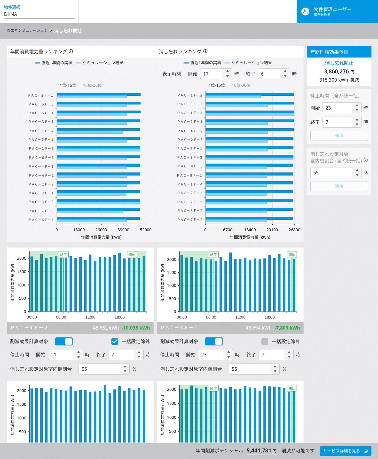
Also, in the screen where the advanced settings for temperature and usage time are set, the visual elements of the graphs were improved to quickly show at a glance which part of the power consumption is assumed to be reduced. We were able to show the correlation between the simulation setting conditions and results more simply, and I think this has led to greater customer satisfaction.
Additionally, in response to the needs of customers wanting to closely manage energy details, we made it possible to display a ranking of the top 30 systems for electrical power consumption that excluded from the calculations those areas where temperature control is important and where constant air conditioning is required.
However, as the number of graphs and setting items increased, the entire screen became cluttered and difficult to understand. For this reason, we made design improvements, such as displaying the ranking by switching pages and arranging the setting items for one system in a compact manner so that they can be seen all at once.
What UX Brings to Design
Not only this time but also in future development, I would like us to repeat the UX process and continue updating personas, customer journey maps, and similar elements to further enrich content. In the process, I would like to improve the UX process itself and develop it into something that can be used for general purposes.
The primary purpose of introducing a UX process is not only to meet the needs of the actual worksite, but also to identify the potential issues that customers may have but are not yet fully aware of. I think that this will bring the design of products and services closer to what is essential to our customers.