

With the increased concern in air due to the COVID-19 pandemic, the need to instantly know air quality has become absolutely vital. To meet this challenge, two Daikin designers specializing in air were recently assigned a project for visualizing air conditions. From opposite ends of the spectrum, these designers utilized their respective skills in tandem to visually represent air. Here they discuss with us their struggles and aspirations for the future.
Could you give us a summary of this project?
Adachi:
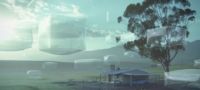
To enable people to work in offices with confidence, there is a need for visualization of current air conditions. In this project, we were tasked with designing graphics that utilize Daikin technologies to visually convey real-time air conditions.
As we began to consider how to express air conditions, we also assumed a variety of other situations, including cafes where customers would know the conditions of their floor seating and retail stores where employees would know the conditions of their backroom.

Yoshikawa:
The design features a number of set display patterns, including for direct display with numerical values and for sensory perception, that users can select according to their needs. In the design process, we asked ourselves questions: “How can we effectively represent conditions for air comfort and ventilation?” “Are the representations suitable without being overstated? “Do they convey an objectiveness that people will accept for both good and bad air conditions?”
With these questions in mind, we sought visual expressions that would be good indicators of air quality.
Adachi:
The concept is based on three modes characterized as Circle, Liquid, and Flag. Liquid has an object in the center that moves in response to the wind and other particle-like objects fly around it in the background. While these particles signify the particles and molecules in the air, I would like people to visually experience air comfort by conveying a soft, fluffy feeling of the wind. Coloring was determined with cleanliness in mind. Liquid is fluid, but the name is based on the concept of liquid color gradation. Rather than being an abrupt change, I imagined a soft color transition in which colors gently mix together and extend out like watercolors.
Liquid
All three modes use the same colors. Refreshing colors of blue and green are used for clean air conditions. From these, the colors deeply change to colors of yellow, orange, and reddish purple. Reddish purple signifies to users that ventilation is recommended.
Yoshikawa:
When deciding color, we referred to an air index called the Air Quality Index (AQI). Because AQI expresses the degree of air pollution, it wasn’t necessary to use the same colors in the index. Also, using the same colors would make it difficult for people suffering from dichromatism and monochromatism to differentiate colors and color composition. For this reason, we adopted a 5-color gradation composition that is unique to Daikin. Blue, which is also a Daikin corporate color, was used as the color to represent the best condition, and it is the color used in air purifiers to show low CO2 concentration.
Adachi:
Flag started with the idea of being a little more abstract by representing wind as it occurs when air is moving. It uses the image of a cloth swaying in the wind, and the main visual is one in which the cloth is slightly floating. Even though wind itself is invisible, air convection is conveyed by the manner and speed in which the cloth moves and changes color. I hope people can visually experience the sensation of air by seeing a swirling cloth whose movements become steadier then gradually slower.
Flag
Yoshikawa:
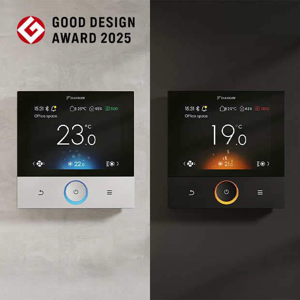
Among the three modes, “Circle” is the one that conveys information in a direct manner and is designed to quantifiably inform you of the air conditions through numbers. Liquid and Flag can turn text information ON and OFF. When text information is turned OFF, only the image and mood will be conveyed.
However, Circle does not have an OFF function for text information. Numerical information and graphics are positioned to convey air information in a simple manner.
Circle
Adachi:
This mode is recommended for air conditioning management in store backrooms and offices.
Yoshikawa:
Circle is designed to alert you when it is nearing time to air out the store or office. The visual concept is one of breathing air. In the middle of the screen, there is a circle representing the act of breathing. The breathing rhythm is expressed by repeatedly having the color band surrounding the circle fade in and out to simulate the expansion and contraction involved in breathing. When the air in a room is well ventilated, the movement takes on the appearance of deep, relaxed breaths, and when the air becomes stagnant it resembles short, rapid breaths.
What effect do you expect to induce with these images?
Adachi:
Because it is an index that notifies you when the air is stagnant and when room occupancy has increased, I think it can be used to indicate when to take action, such as opening a window or turning on the AC ventilation function. The aim now for the first stage of the project is visualization, but I’d like to expand it in the future as a notification service through the development of systems and applications that connect to air conditioner models so that air conditions can be quickly and easily understood on operation screens, personal computers, and smartphones.
Yoshikawa:
I don’t want to just display it. I want it to lead to a new business. In creating the design, I also considered how to make the main visuals of Circle, Liquid, and Flag seem cute or funny like a familiar character.
Was there something in the design process that each of you focused on in particular? What issues did you struggle with?
Adachi:
To start with, I was fussy about color. As I said before, the emphasis was on soft, smooth gradations similar to liquid, and when displaying colors, I placed value on not only the gradation, but also on color coordination between colors. Air conditions are not something that can be delineated. With this in mind, yellow, for example, is mixed as a gradation when transitioning from blue to green. When yellow is seen the next time, it appears as a reddish orange...This was done in thinking that I wanted to express a seamless change between colors.
The difficulty was conveying the differences at each stage while making sure the movements were realistic. For example, in Flag, movements gradually fluctuate from the comfortable airflow that a black kite uses to float in the sky to air turbulence that is lackadaisical and floppy. Since this cannot be expressed simply by strength, I studied typical movements by adjusting each parameter such as speed, strength, air turbulence, and air resistance in 0.1 units. I repeatedly came up with various ideas, narrowed down the direction to some extent, and made a sample motion by which I received various comments from Yoshikawa. I used those remarks to correct the trajectory and make revisions for the sample motion before getting her comments and discussing it again.
Yoshikawa:
We had many discussions. There were only a few times when we disagreed. I think we mutually voiced our ideas with statements like, “The way it sways in the wind gives off a good vibe” or “This movement looks a little like a dirty river.” All in all, I think that I said everything that I wanted to say.
Adachi:
There were many times while the two of us were talking when I could suddenly see the finish line. Rather than thinking entirely on my own, having someone help me see from a slightly different perspective made me truly feel that the path before me was steadily widening.

Yoshikawa:
What I found amazing was how exacting she was in the expression of textures. For example, in the design of Flag, she was quite the stickler for expressing the soft, fluffy texture of real cloth to prevent the visual from taking on that mechanical look of digital information. It was incredible.
In Circle, I perceived a great balance between lucidity and sensory perception. I battled with how far I could convey the sensation of “feeling good” through subtle shades of color and movements of the background color and labored until reaching a level that I was satisfied with.
In my work, I usually think of three-dimensional images such as easy-to-use button positions and beautiful shapes, but I knew very little about conveying motion in the world of flat planes. Adachi’s knowledge greatly helped me.
When thinking back now, what was good about being responsible for this project?
Adachi:
This is the first time that I have incorporated 3D model simulations. In my UI work, thickness is usually expressed by overlapping planes. With 3D, depth and perspective become elements for expression. Even concerning movement, there was also a point in which simulations provided a likeness that could be understood, and this was not something given shape by an image in my head. While trying to master new skills was difficult, I think I gained proficiency enough to receive satisfactory results. It felt great to enter a previously unknown world to me.
Yoshikawa:
There was a high degree of difficulty because of the issue that motion means “moving,” which is substantially different from the design drawings and designs that I’m used to seeing. However, while struggling against flat planes, I took on the challenge of visualizing moving air by utilizing knowledge of Color, Materials, Finish (CMF) that is important when thinking about a project.
Having been challenged to visualize this time, what does “Air” mean to you?
Adachi:
While air may be invisible, it certainly does exist around us, and many living creatures depend on it to live. Humans have especially enriched their lives through air such as air conditioning and transportation. Unquestionably, the air that allows people and living creatures to spend their time free of anxiety is needed, but we also need the value that air brings with it to enrich our lives.
Through this recent task for visualizing air, I would like to connect this idea of seeing, feeling, and sharing it to the development of products and make use of air for society.
Yoshikawa:
While air mostly remains in the background and is largely taken for granted, there are other times when a temperature or smell can stir your feelings. For this reason, I always want to provide relaxation and comfort in both the machines that deliver air and the services accompanying them, and I think that this leads to creating air that is worthy of the Daikin brand. The visualization of air that we challenged this time can become a communication tool with air serving as a common language. In moving forward, I would like to think of the ideal conditions for optimal air in each space, communicate that ideal, and utilize those conditions to share air comfort with people around the world. I think this is the first step.